about
● chat
● links
● archives
Monday, December 12, 2011
How Many Words Can Fit? @ 2:52 AM

I found this set of images in the
Communication Arts January/February 2011 issue. This was created for
Crate & Barrel for their cocktail set of words. You can't really read the tiny print, but a lot of the words are related to the actual items (even sometimes, they will have the word "ice" in them with a square to represent what could potentially be the ice cubes). This brings an engagement to my eye because one could've simply taken a picture of the object and used the keywords inside of the pieces towards an advertisement. Instead, they choose to engage the viewer with as many words as possible and to let the viewer have their own imagination about the product. Simple, yet very inviting. Almost reminds me of what Lou Dorfsman did with the wall of type!
Wednesday, December 7, 2011
Tak Website @ 7:18 PM
This website layout comes from the
CMYK Volume 44 magazine. Usually, websites have standard places where the pictures fit into a nice grid with plain text. This website has a great theme with an excellent place where the eye is drawn for the viewer. Intriguing pictures that all somehow interconnect. It's unfortunate the website is no longer available for myself to examine; but I can tell that it has an overall structure that will be consistent throughout. This was a magazine which targets Eastern European Immigrant designers who came to America and tells of how life is here. To view more pictures, visit the person that created the website
here.
Wednesday, November 30, 2011
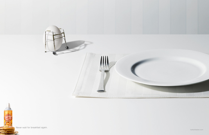
Slow Breakfast Made Fast @ 5:43 PM
I found this advertisement in the Communication Arts November 2008 Annual and thought it was a great example of how restaurants can be very slow at bringing breakfast to your plate; literally. The use of the egg with a mini walker, slowly walking to a plate emphasizes this idea greatly that this product is ready to cook so you can eat breakfast quicker. Surprisingly, I'm very intrigued by the product when I view it and know how it can serve my needs; though I didn't realize at first the Batter Blaster was actually batter you can put right away onto the pan and cook. I should've known it literally meant that, but I didn't believe it. Hopefully, I can find this product and try it.
Wednesday, November 23, 2011
Going Naked @ 8:20 PM
This is an advertisement I found in CMYK in Volume 4, where it's basically a scene like any other drawing class with the students drawing the volunteer that wants to "bare it all". Instead, they portray this cliche scene with fruit (the oranges as the student and the banana as the volunteer). It's already a great advertisement without needing much more, but a nice touch is the copy says:
"Naked is your most natural state".
I love the combination of the photographs with the illustration style of the easels and the background itself to make everything else stand out. Makes me want to go to my natural state and buy some Naked juice.
Thursday, November 17, 2011
Watch Out for the Paparazzi @ 3:54 PM
I found this magazine called "Hate" by Calvin Holbrook in the July 2011 issue of
Computer Arts. He said he got most of his inspiration from style and humour, combining the "anarctic handmade, cut'n'paste, devil-may-care sense of humor into the paparazzi magazine. He got most of his images from London's newspapers (where he currently resides). I believe this is a great way to attract my attention from just the ordinary paparazzi magazine because these types of magazines today are so grid like and has edges; versus being able to see just the people and bringing them in a humorous light. Especially with the comic bubbles acting as the headlines, as you can see with the cover on the left. If magazines were like this in the United States, then I would be very tempted to buy them more than the other magazines.
Thursday, November 10, 2011
Feel Like Royalty @ 12:17 AM
I found this in CMYK #47 and think that it's a very clever way to sell dog food. The brand is called
Royal Canin, which would make any dog (especially pug dog) owner feel that they should buy it to make them feel they should treat their canine friend like royalty. The photographs are the dogs are excellent and are what make the packages so great! What adds to the photographs is the crown being put on top of each of the dogs and there are arrows pointing at certain parts of the dog to reemphasize how the food will keep your dog healthy for longer (or ways the owner should make them feel more like the king of the castle). If I were an owner, this would definitely make me feel like I should buy this brand for my dog!
Wednesday, November 2, 2011
Quite the Bombshell! @ 11:53 PM
I was doing research for my next project in Illustration 1 class and stumbled upon this wine bottle design and think it's very creative! It literally takes the name (which is very creative in itself) and takes it to the almost American Kitsch level combined with the late 1930s - 40s feel (King Kong). I love the illustration and how they make it seem like it's a movie poster and makes you excited to drink it because you'll look (and feel like) the blonde bombshell on the front of the cover! Now I'm not sure if you'll be an extra terrestrial like they're trying to make her out to be, but I give credit to people that can be out there like this and sell it well.